Engineering Data
In Data Visualisation I looked at the general concept of using a Visualisation Method to make the meaning of data more apparent and gave two examples. In this post I look at how we use this is our own business creating new Electronics Products.
Engineering Data is the information used by Engineers to do their work. In our case the Engineering Work is Electronics Design. Data Visualisation is used at both the Engineering Design phase of a project and also the Test and Verification phase. For this post we will look at how test results can be better understood visually.
3D Gravitic Sensor
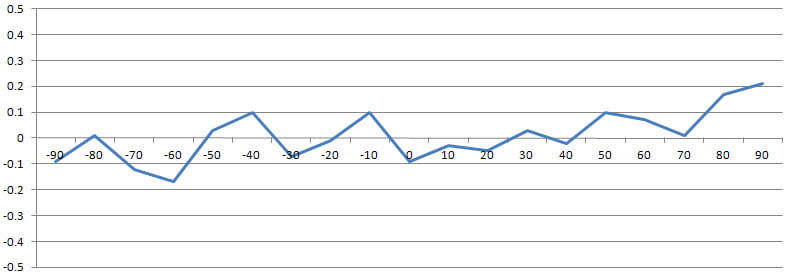
The first example is a 3D gravitic sensor used for Solar Tracking. We were required to keep the panels on sun using an almanac and had to maintain this within 0.5° because this was a concentrated solar system. The cradle angle was not simple to measure because the panels are on an angle to suit the latitude of the installation. But we had to now the cradle angle within 0.25° to be sure we were on sun within 0.5°. This was our share of the error budget, another Engineering Concept. Here are the results in tabular and graphical form.
First the table:
| Digital Protractor Angle | Gravitic Angle | Gravitic Error |
| -90 | -90.10 | -0.09 |
| -80 | -79.98 | 0.01 |
| -70 | -70.12 | -0.12 |
| -60 | -60.17 | -0.17 |
| -50 | -49.97 | 0.03 |
| -40 | -39.90 | 0.10 |
| -30 | -30.08 | -0.07 |
| -20 | -20.02 | -0.01 |
| -10 | -9.89 | 0.10 |
| 0 | -0.09 | -0.09 |
| 10 | 9.96 | -0.03 |
| 20 | 19.94 | -0.05 |
| 30 | 30.04 | 0.03 |
| 40 | 39.98 | -0.02 |
| 50 | 50.10 | 0.10 |
| 60 | 60.07 | 0.07 |
| 70 | 70.01 | 0.01 |
| 80 | 80.17 | 0.17 |
| 90 | 90.22 | 0.21 |
Then the graph:
In this case the graph makes it immediately apparent that the unit passes the test. It would have been even easier to see if there were solid red lines at +0.25° and -0.25°.
Precision Temperature Measurement
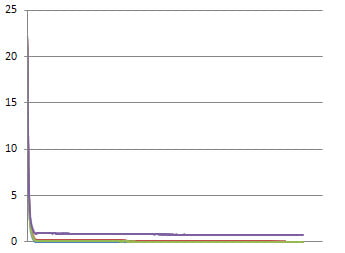
The second example is a set of PT1000 RTDs used for precision temperature measurement. For this project the required accuracy was 0.5°C absolute and 0.2°C relative to each probe. A simple test was done where we put the probes into recently boiled water and recorded the temperature using a precision temperature data logger we had developed . We knew that the near step change would cause initial divergence in the results but we wanted to see how quickly they settled. So the options were three columns of data points 16,000 readings high, or graph it. Guess which was easier to understand!
Here is the end of the numerical results with the initial 15,992 rows not shown:
| Time | RTD1 | RTD2 | RTD3 |
| … | … | … | … |
| 11/07/2011 15:17 | 21.6 | 21.7 | 21.7 |
| 11/07/2011 15:17 | 21.5 | 21.7 | 21.6 |
| 11/07/2011 15:18 | 21.5 | 21.6 | 21.6 |
| 11/07/2011 15:18 | 21.5 | 21.6 | 21.6 |
| 11/07/2011 15:19 | 21.5 | 21.6 | 21.6 |
| 11/07/2011 15:19 | 21.4 | 21.5 | 21.5 |
| 11/07/2011 15:20 | 21.4 | 21.5 | 21.5 |
| 11/07/2011 15:20 | 21.4 | 21.5 | 21.5 |
And this is the graph of all the RTD temperature readings:
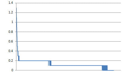
And finally, this is a graph of just the differentials between RTDs:
This last graph makes it much easier to see that the probes settle to within 0.2°C of each other almost immediately and stay there or below for the rest of the graph.
The three sets of results are the same data. But how we look at it changes how easily we can understand it.
There are many other examples possible but this is enough to show the idea in action.
Successful Endeavours specialise in Electronics Design and Embedded Software Development. Ray Keefe has developed market leading electronics products in Australia for nearly 30 years. This post is Copyright © 2012 Successful Endeavours Pty Ltd


