Data Visualisation

Seeing Information

My previous post on Information Overload identified the problem we have with handling all the data that is being created in our modern Information Age world. This post has 2 simple examples of the power of information and how it can be more easily understood using Data Visualisation techniques.


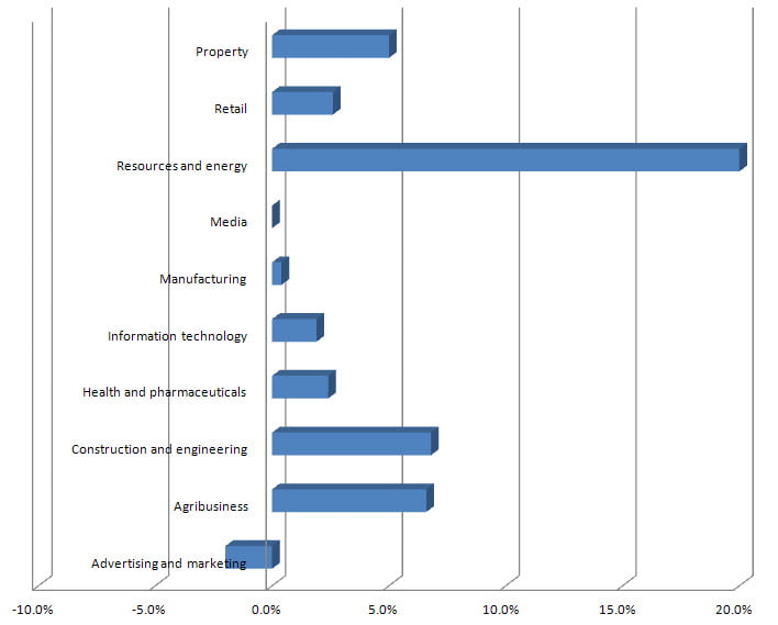
I recently received an email showing the expected growth trends in the Australian economy in 2012. One of the things I found hard to make sense of from the article was exactly which sector was doing better so I decided to pull the information from the post for the sectors that had it, put it into excel and do a graph. This is the essence of Data Visualisation. Here is what I came up with.


Data Visualisation

Data Visualisation

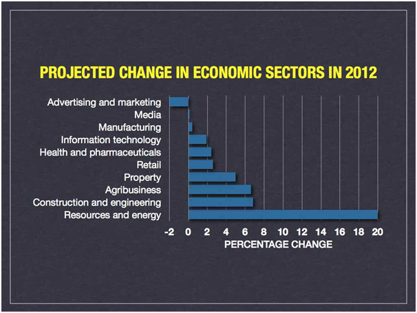
So from this we can now see, that is the point, that the Resources and Energy sector is expected to grow very strongly whereas Advertising and Marketing is shrinking. I sent a copy of the graph to our business mentor Dr Marc Dussault, The Exponential Growth Strategist, as I thought he would be interested. He reworked it slightly and sent back this:


Better Data Visualisation

Better Data Visualisation

There are 2 changes here. The first is that the data is ordered so the trend is clearer. Organising the data better can improve the understanding you get from the same data using the same Visualisation Method.


The second change is that the formatting of the data is more attractive which makes it more likely the information will be looked at. Marc says that is because he did his graph using a Macintosh computer whereas I used a PC running Windows. That is a long running debate but in this case the visual results are clearly better. So formatting the visualisation also helps.


Seeing Connections

Sometimes it is the relationship between pieces of information that is important. This second example is our website. This is done using a HTML Tag Diagram Viewer. My thanks again go to Dr Marc Dussault, The Exponential Growth Strategist for providing this link. The link redraws our primary domain but you can just put your own in if you want to see what that looks like. It was created by Marcel Salathe so my thanks also go to him for creating and making freely available such a useful tool.


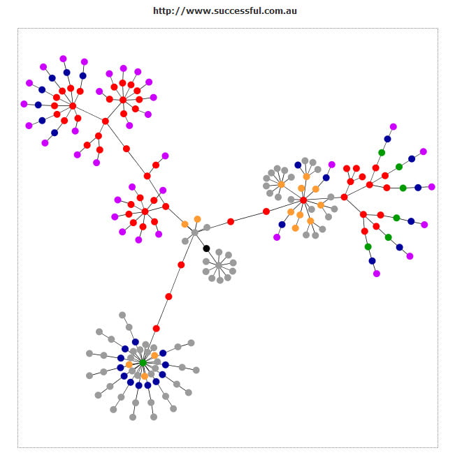
Here is what the graph for http://www.successful.com.au looks like.


www.successful.com.au Website Visualisation

www.successful.com.au Website Visualisation

This shows how the tags on the pages relate to each other and how the pages link from the home page in the centre to the rest of the pages on the domain. The blog shows as a cluster only in this view. Here is the legend for understanding the colours.


  • Blue: for links (the A tag)
  • Red: for tables (TABLE, TR and TD tags)
  • Green: for the DIV tag
  • Violet: for images (the IMG tag)
  • Yellow: for forms (FORM, INPUT, TEXTAREA, SELECT and OPTION tags)
  • Orange: for linebreaks and blockquotes (BR, P, and BLOCKQUOTE tags)
  • Black: the HTML tag, the root node
  • Gray: all other tags


So this information is both graphically represented and also Colour Coded, another Data Visualisation technique.


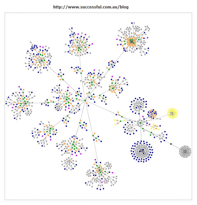
I then decided to see what just this blog would look like.


blog.successful.com.au Website Visualisation

www.successful.com.au/blog Website Visualisation

So the blog is a lot more complicated. And that also makes sense. There are more outgoing links and more interlinking since I also reference other posts.


As an Electronics Design company we use Data Visualisation all the time to help us analyse both research results and test results. So I plan to show a few examples of that in my next post.


Successful Endeavours specialise in Electronics Design and Embedded Software Development. Ray Keefe has developed market leading electronics products in Australia for nearly 30 years. This post is Copyright © 2012 Successful Endeavours Pty Ltd

Information Overload

How Much Data?

According to IBM, 90% of the data created in the history of the world, was created in the past 2 years. The article was looking at Social Media Information but the claim was generic. Talk about Information Overload. How do we keep up with this?


There are sceptics that believe this Data Deluge is overstated but even if they are out by a factor of 10, it seems we are in danger of moving from the Information Age to drowning in data.


I worked with a very fast thinker once. Working with him was like trying to see ahead underwater while travelling in the wake of an outboard motor engine. The trick was to decide what to ignore so you could just address the important things. He used it as a tactic to get his own way during meetings. I was reminded of this while thinking about this topic. It seems the whole human race is about to face the same dilemma. How to sort the important information from the huge volume of total information being produced.


Information Overload

Information Overload

Information Relevance

Not all of information produced is of the same quality, usefulness or relevance. Assessing Information Relevance will become increasingly more important. A post on Facebook letting us all know that someone’s dog just farted is not as valuable to know for most of us compared to the passing of a new law that puts a carbon tax on high carbon emitters.


The CERN Large Hadron Collider (LHC) is expected to produce data equal to 1% of the worlds production rate when it is running. This required a new approach to data storage. For those who aren’t familiar with it, the Large Hadron Collider is a higher energy version of the Australian Synchrotron which has specialised detectors that examine the fine details of how the matter of the universe is constructed. The intent is to look for evidence that the Higgs Boson exists as predicted by the Standard Model of particle physics.


CERN Large Hadron Collider

Test Everything

I mention it here because they have to record the experimental data knowing that it may be some time before they can fully interpret it. They have planned for the Information Overload as well as the long term Information Storage.


In fact it is a great example of long term planning with the original proposal in 1985 and the construction beginning in 1994 and being complete in 2008.


Stephen Wolfram has put together a timeline of the Advance of the Data Civilisation and if you are keen you can also buy the Historical Timeline of Systematic Data from them.


Information Storage

So how do you store all that data?


If we used DVDs it would produce a stack that goes to the Moon and back. That’s too big to store as DVDs.


The increase in data comes from three sources:


  • new data sources such as ubiquitous sensors, LHC, business metrics, research…
  • increased data creation from existing sources such as social media, blogs, web publishing…
  • unprecedented processing power


So far the storage solution is the growth of server farms and while many higher density storage technologies are being investigated, most data is stored on conventional hard disks. Redundancy and data security are of course hot topics.


Hard Disk Storage

Hard Disk Storage

Information Processing

The other major issue is how do we make sense of all this data. Traditional data Integration tools are considered to be not ready for Big Data, and this is likely to get worse before it gets better. Information Processing is going to be one of the opportunity areas of the next decade.


According to CNN, Data Scientist will be one of the hot jobs in 2022.


Even in the much smaller world of Successful Endeavours where we develop new products and have to do the Innovation, research, Prototypes and testing associated with them; managing all the data requires both discipline and planning.


Successful Endeavours specialise in Electronics Design and Embedded Software Development. Ray Keefe has developed market leading electronics products in Australia for nearly 30 years. This post is Copyright © 2012 Successful Endeavours Pty Ltd